
Color Psychology in Exhibition Design: A Guide to Creating Impactful Trade Show Experiences
Related posts


In the competitive world of trade shows and exhibitions, standing out from the crowd isn’t just desirable — it’s essential. As an experienced exhibition stand builder, I’ve witnessed firsthand how the strategic use of color can transform an ordinary display into a magnetic attraction that draws visitors and leaves lasting impressions. The psychology of color in exhibition design goes far beyond mere aesthetics; it’s a powerful tool that can significantly influence visitor behavior and brand perception.
The science behind color psychology reveals fascinating insights about human behavior. Our brains process color before shapes or text, making it our first point of connection with any visual display. This immediate emotional response can significantly influence visitor behavior at trade shows, where first impressions happen in milliseconds. Understanding this psychological impact is crucial for creating effective exhibition stands that not only attract attention but also convey the right message.
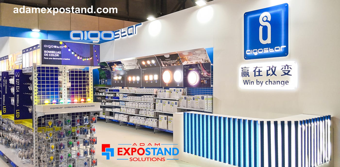
Different colors evoke distinct emotional responses and associations. Blue, for instance, creates a sense of trust and professionalism, making it particularly effective for technology and financial services companies seeking to establish credibility through their exhibition stands design. Red stimulates excitement and creates a sense of urgency, making it perfect for calls-to-action and highlight areas within trade show displays, though it should be used judiciously to avoid overwhelming visitors. Yellow captures attention and conveys optimism, working best as an accent color to draw eyes to key messages or features.
When it comes to implementing color in exhibition design, successful exhibition stand builders understand the delicate balance between brand consistency and show-stopping appeal. While maintaining brand colors is important, there’s room for creativity in how these colors are used and combined with complementary hues. The key lies in creating a cohesive design that reflects brand identity while standing out in a crowded exhibition hall.
Color zoning presents an effective strategy for larger exhibition stands, helping to define different functional areas and guide visitor flow naturally through the space. This approach creates clear distinctions between areas dedicated to product displays, meeting spaces, and interactive zones, all while maintaining visual coherence throughout the stand. The thoughtful use of color can create natural transitions between these spaces, making the overall experience more intuitive for visitors.
The interaction between lighting and color plays a crucial role in the success of trade show displays. LED lighting can dramatically enhance or alter color perception, and different times of day affect how colors appear to visitors. Professional exhibition stand builders consider these factors during the design phase, ensuring that colors remain impactful regardless of ambient lighting conditions. This attention to detail can make the difference between a good exhibition stand and a great one.
Different industries require different approaches to color psychology. Technology companies often benefit from cool blues and whites to convey innovation, while retail and consumer goods brands might opt for warmer, more inviting colors to encourage engagement. Sustainable and eco-friendly brands typically find success with natural greens and earth tones that reinforce their environmental messaging. The key is aligning color choices with industry expectations while finding ways to stand out within those parameters.
Working effectively with exhibition stand builders requires clear communication about color preferences and requirements from the earliest planning stages. Sharing brand guidelines, discussing lighting requirements, and considering the show venue environment all contribute to successful color implementation. Professional builders will often provide 3D visualizations with accurate colors, allowing clients to test different combinations and ensure the final result meets their expectations.
Success in exhibition stand color design can be measured through various metrics, including visitor dwell time, engagement levels, and lead generation numbers. The most successful trade show displays strike a perfect balance between aesthetic appeal and strategic purpose, using color psychology to create an environment that not only attracts attention but also facilitates meaningful interactions with visitors.
Looking to the future, exhibition stands design continues to evolve with new technologies and approaches. Interactive color-changing elements, smart lighting integration, and sustainable color materials are becoming increasingly prevalent. Digital color customization options are also emerging, allowing stands to adapt their appearance for different audiences or times of day.
Exhibition success ultimately comes down to creating an environment that resonates with visitors while effectively communicating brand messages. By understanding and applying color psychology principles, exhibition stand builders can create displays that not only capture attention but also create meaningful connections with visitors. Whether planning a new exhibition stand or refreshing an existing design, letting color psychology guide your decisions will help maximize your trade show impact and return on investment.
The most effective exhibition stands are those that tell a cohesive visual story through their use of color, making every element work together to create a memorable experience. By partnering with experienced exhibition stand builders who understand these principles, businesses can create trade show displays that stand out from the competition and achieve their marketing objectives. The key is to approach color not just as a design element, but as a strategic tool that can influence behavior, convey messages, and create lasting impressions in the minds of visitors.


